We love a classic text tattoo! To make sure yours come out perfectly, here are a few things to keep in mind.
💁🏽♀️ Pro Tips for spacing your text:
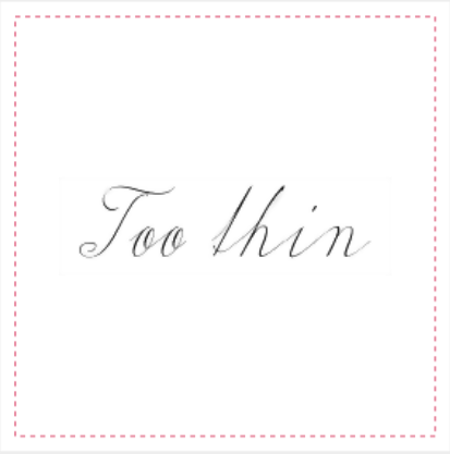
- Avoid small spaces between letters and fine lines in the text. Thinner, truncated lines increase the chance that your design may smudge once applied - we definitely don't want that! 😰
- The negative (white) space between letters should be at least 4px /0.11cm / 0.4in.
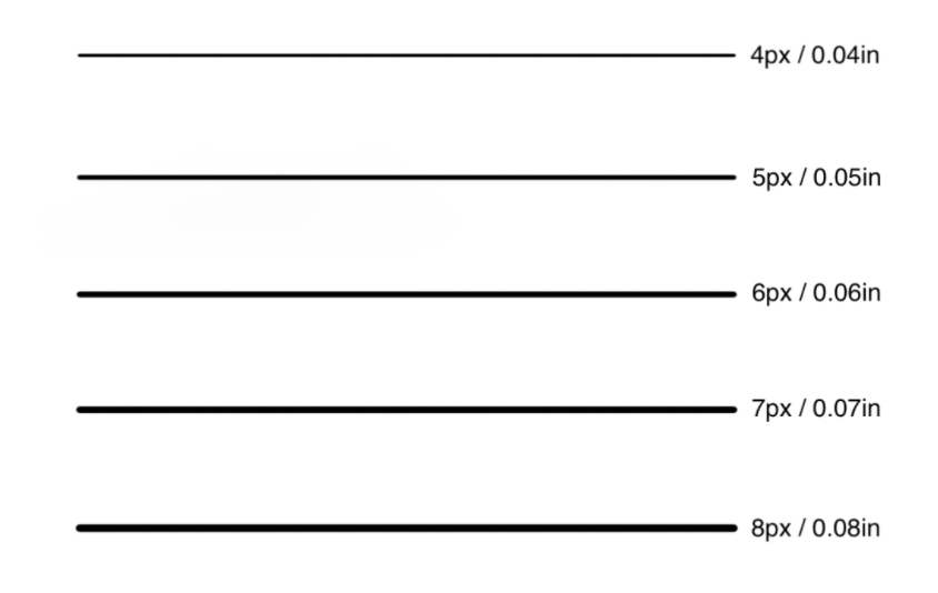
- The letters should be a minimum of 4px in thickness (see line weights chart below!).
- When creating a design with many words, break your text up into multiple lines.
What To Avoid 👇

💡 What do different line weights (thickness) look like?
📩 Still have questions? Email us at custom@getinkbox.com.